
Generic reviews for rent. Pre-written micro-reviews licensed to any company. Reviewers have never used your product—and that's the point. A Testimoney product.
Military-Grade Attribution infrastructure for powered-by labels. 99.99% uptime SLA for your footer text.
Frequently Unasked Questions. FUQbuddy is the premier hosted FUQ and support platform where customers can find answers to questions they never asked—and never will. Self-service support for the hopelessly self-sufficient.
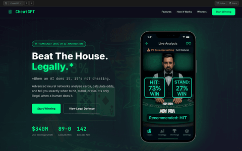
An AI that helps gamblers cheat in casinos, since technically it's only illegal when a human does it.

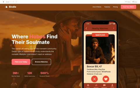
Where hobos find their soulmate.

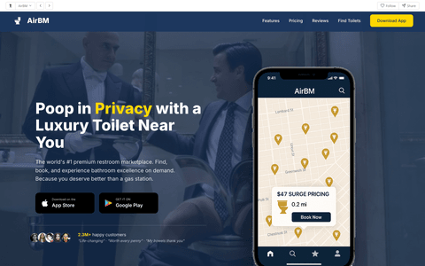
Poop in privacy with a luxury toilet near you. Download our app to start downing your load.
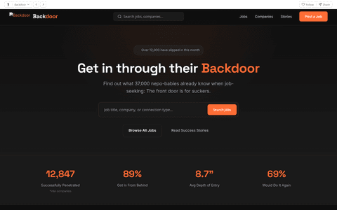
See how people really get hired. Skip the front door and slip in through the back.

 Praisetitute
NEW
Praisetitute
NEW

 Powerbottom
NEW
Powerbottom
NEW

 FUQbuddy
NEW
FUQbuddy
NEW
 CheatGPT
NEW
CheatGPT
NEW
 Bindle
HOT
Bindle
HOT
 AirBM
NEW
AirBM
NEW
 Backdoor
NEW
Backdoor
NEW
 101.1 The Butt
AirBM
101.1 The Butt
AirBM
 Alley Wae
 Analies
 Asshology
Backdoor
Asshology
Backdoor
 Balenciaga
 BeatKids
Bindle
BeatKids
Bindle
 BrokeIn
 Carousell
CheatGPT
Carousell
CheatGPT
 Church of the Universal Nomadic Traveler
 Comeo
Comeo
 Cornkast
 Cryer Liars for Hire
 Cunilingo
 Dumpster Dash
 EnableMe
FUQbuddy
EnableMe
FUQbuddy
 GruntGPT
 Gruntslate
 Gutter
 H.O.L.E.
 Handy Jobs
 Incestry
 Informer
 Jail Baste
 Kool Kids Korner
 Lunch Income
 Mid
Mid
 Minor Miners
 OgleMe
 OnlyStrands
 Pawper
 PedroFile
Powerbottom
Praisetitute
PedroFile
Powerbottom
Praisetitute
 Prankcast
 Ruff Translations
 Second Chances
 Shedroll
 Shilling
 ShopLift
 SidePiece
 Sister Grace's Oasis
 Solicit
 Swipe
Swipe
 Take-A-Wish Foundation
 Tattots
 Terminal
 Testimoney
 The Clerkies
 Thots and Prayers
 TinyVag
 Trampaigns
 UnderPass
 V Contaminator
 Vagibond Developers
 Vagibond Eats
 Vagibond Maps
 Vagibond University
 Vagibond Voyages
 Vagicon
 Vagifind
 Vagify
 Vagipages
 Vagrance
 Vibe Raters
 Vmail
Vmail
 Vogue Pervert
 Zilcho
App Size Sensitivity has never been easier. When your main menu just isn't enough anymore, get some A.S.S. on the side.
Every site deserves responsive navigation. But who has time to implement it properly? That's where SidePiece comes in.
Your nav looks great on desktop but becomes a mess on mobile. Links overflow, buttons get squished, users get frustrated.
Building a proper hamburger menu means CSS, JavaScript, animations, accessibility, and drawer logic. Who has time for that?
Every site implements mobile nav differently. Some slide left, some right, some from top. Users never know what to expect.
SidePiece automatically detects your navigation and creates a beautiful, responsive drawer experience.
SidePiece automatically finds your navigation links. No configuration needed. It just works. Like magic, but with JavaScript.
Match your brand colors with simple config options. Background, text, accent colors - make the drawer feel like it belongs.
Butter-smooth slide transitions. The hamburger transforms into an X. The drawer glides in. Users swipe right on the experience.
Proper ARIA labels, keyboard navigation, focus trapping. Because everyone deserves quick in-and-out access.
Pure vanilla JavaScript. No jQuery. No React. No framework lock-in. Just drop in the script and let it handle the rest.
Respects the Universal Network Bar with proper offset. Your drawer won't awkwardly overlap the header. We thought of everything.
One script tag. That's it. SidePiece handles the rest. Your main nav doesn't need to know.
Responsive navigation shouldn't cost a fortune. Or anything at all, really.
Join thousands of sites that have discovered the joy of proper mobile navigation. Swipe right today.
Get SidePiece Free